UCC turns Japanese coffee heritage into a sharper UK growth platform
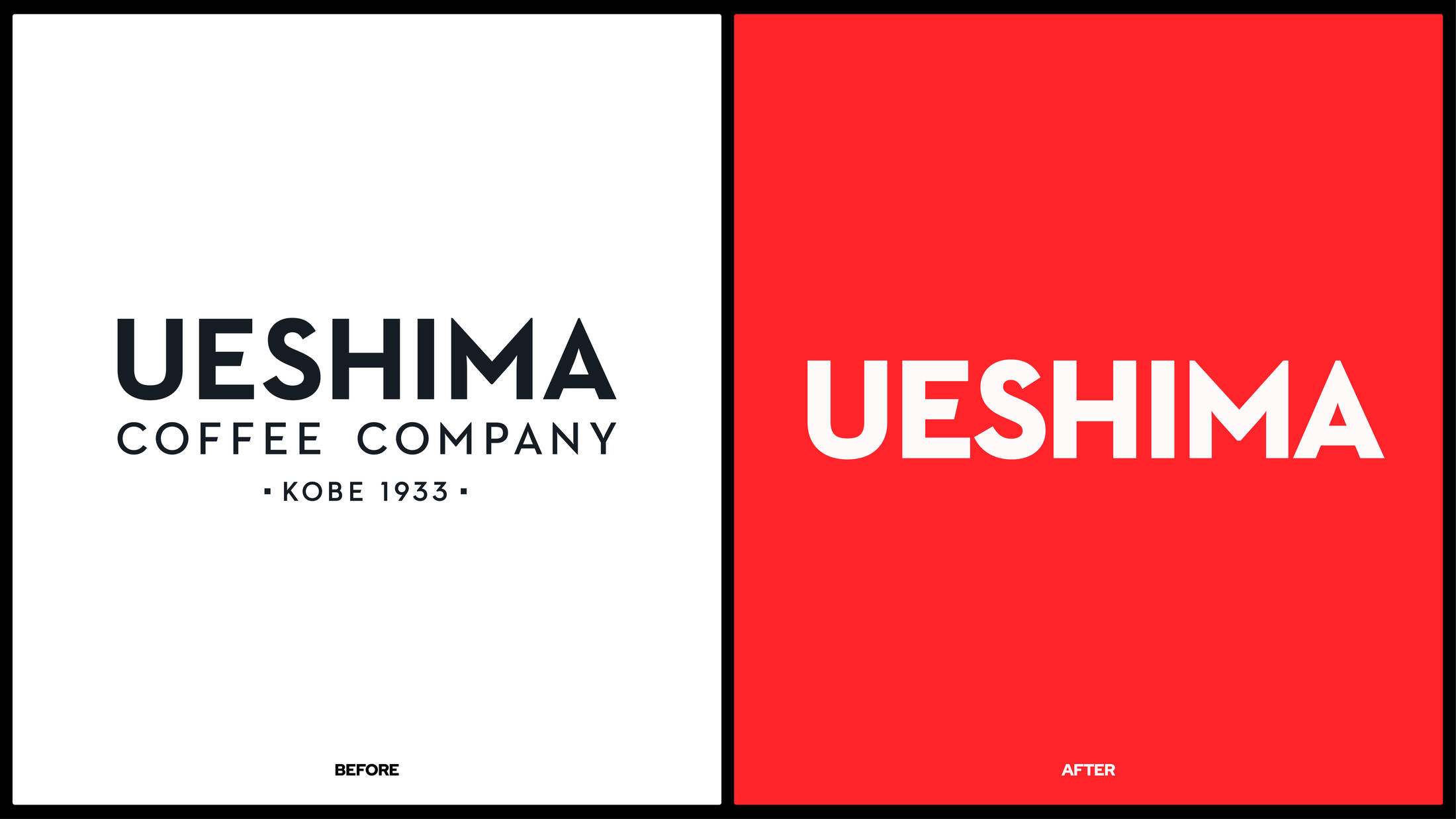
Ueshima Coffee Company refreshed its UK identity around Japanese Coffee Mastery, pairing calligraphy with playful illustration to make heritage work harder across packs, web and retail.
Description
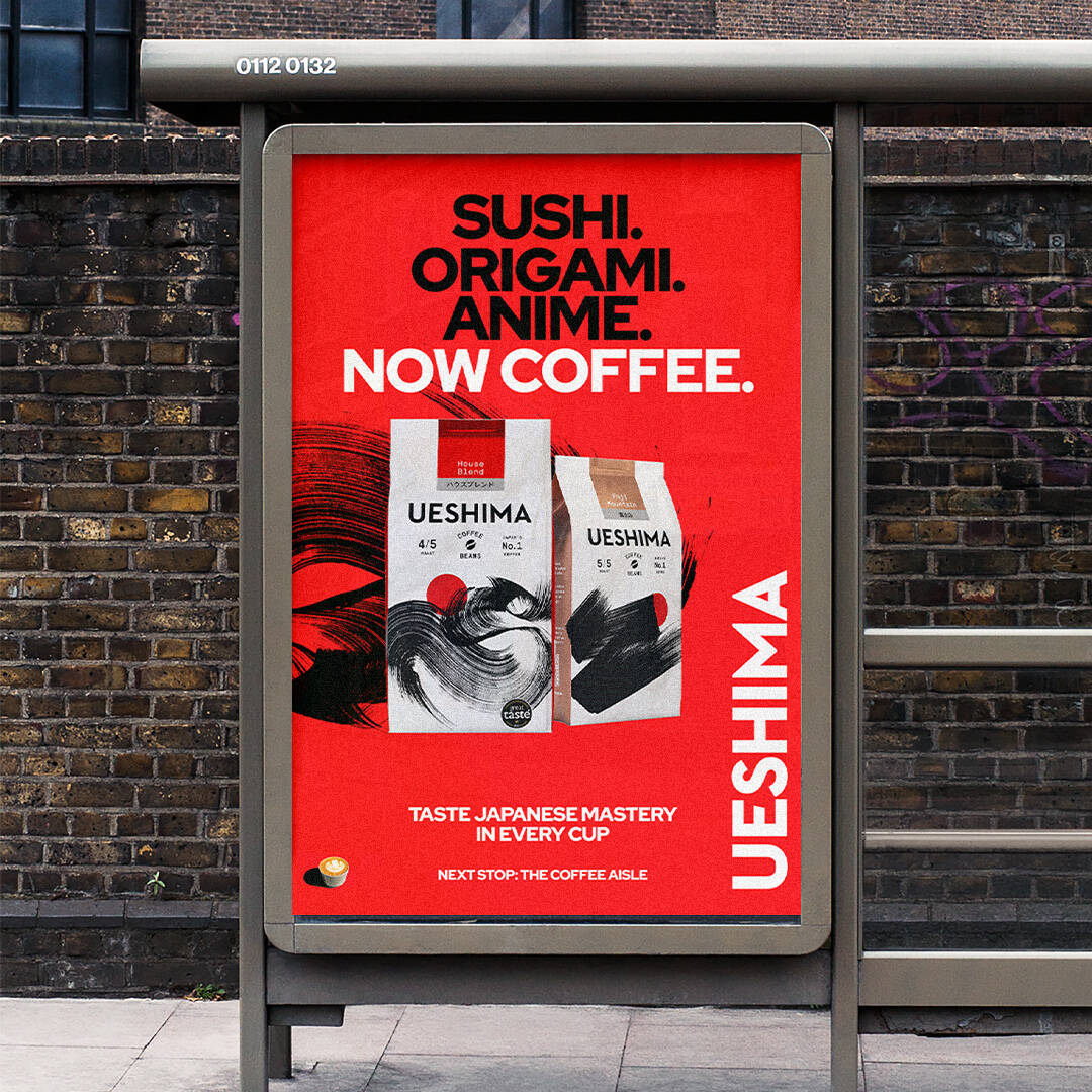
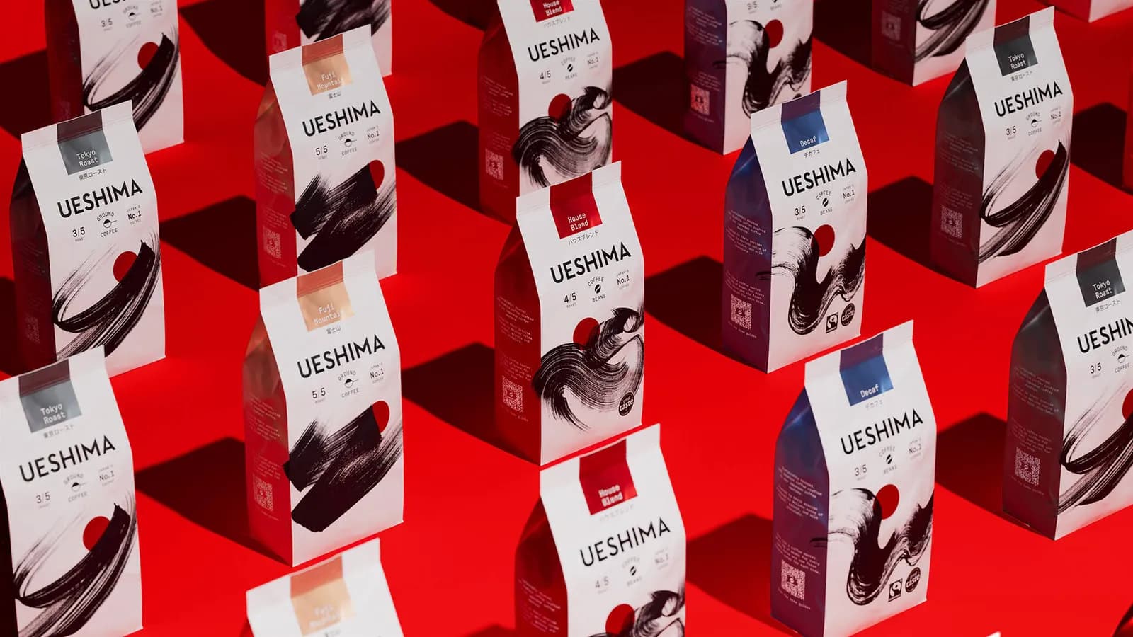
Ueshima’s challenge in the United Kingdom is not simply awareness; it is translating a long Japanese coffee legacy into a shelf-level reason to choose the brand in a crowded ground-coffee market. The refreshed identity makes that translation more explicit with the positioning Japanese Coffee Mastery. Rather than treat Japanese provenance as a decorative cue, the system joins traditional Shodo-inspired calligraphy with more playful illustration, a neutral foundation and vivid colour accents. The result is designed to hold together across packs, web and festival activation while giving Ueshima a more ownable personality than a conventional premium-coffee look. Louise Tabor, Marketing Director at UCC Coffee UK and Ireland, said the refresh is intended to honour the brand’s Japanese heritage while reflecting its next stage of ambition.
The work extends The Clearing’s relationship with Ueshima, which began in 2020; it should not be confused with the original UK launch identity introduced in 2021.
The refreshed look was unveiled at the 2026 London Coffee Festival, placing the new system directly in front of consumers and the specialist coffee community.
The creative idea is Japanese Coffee Mastery: a positioning that connects the brand’s origins, coffee-making expertise and UK growth ambition.
Highlights
- The Clearing developed the refreshed brand identity for Ueshima Coffee Company in the United Kingdom.
- Japanese calligrapher Kashuū created the lettering and calligraphic visual language used in the identity.
- Illustrator Con McHugh supplied a contrasting, playful illustration layer, giving the brand a deliberate dual personality.
- The palette uses neutral base tones with vivid accent colours rather than relying on a single traditional-Japanese visual shorthand.
- A copy-led verbal identity gives the system a repeatable voice beyond the logo and pack artwork.
- The new identity appears across packaging and the website, with the London Coffee Festival used as the public unveiling moment.
Results
5th-largest
Reported UK market position
Ground-coffee brand; agency-reported.
48%
Reported year-over-year growth
Agency-reported; period and methodology not publicly disclosed.
MAD's Verdict
Ueshima is building a recognisable code system that can make Japanese expertise legible in seconds: expressive lettering for craft, illustrations for accessibility and colour for shelf interruption. That is a much stronger proposition for UK shoppers than heritage copy alone. The brand is betting that it can turn cultural specificity into a repeatable retail asset, not a one-off launch story.
Industry Opinions
Creative Review focused on the combination of Japanese coffee heritage, bespoke Kashuū lettering and Con McHugh’s illustration work. That response supports the central strength of the refresh: it gives the brand multiple distinctive assets rather than relying on a logo change alone.